Drawing Disney Villains

There are lots of drawing based activities in the pot luck box because my kids and I love to draw.  A fun one that was plucked from the box this week was to draw Disney villains.  This did not mean we had to slavishly copy the character design that appears in the finished movies.  What this meant was that we thought about those wonderfully awful characters and how we might design them if the concept art job fell to us.  Inevitably, we found we were inspired by the original Disney creations but that is OK.

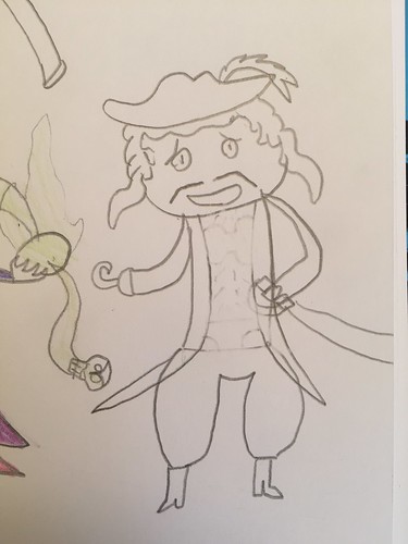
My 10 year old’s version of Captain Hook is much more muscular and dashing than the foppish movie version but he had to keep the hat and hair.  Hook, however, was puny compared to his depiction of Gaston.  Perhaps it was steroid induced rage that made Gaston so murderously enraged towards Beast.  The mullet hairdo makes me smile.  He also drew Facilier from ‘The Princess and the Frog’ and his all time favourite Disney villain (and favourite Greek god) Hades.

Disney Villain - Captain Hook - OA

Disney Villain - Gaston - OA

Disney Villain - Facilier - OA

Disney Villain - Hades - OA

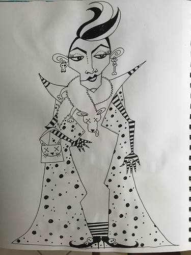
I chose to draw Cruella DeVille not because she is my favourite Disney villaint (that would be either Scar or Ursula) but because I wanted to draw in monochrome and the dalmation clothing and skunk striped hair lent itself to a black and white illustration.  I wanted her to be spiky and angular.

Disney Villain - Cruella DeVil - LRDP

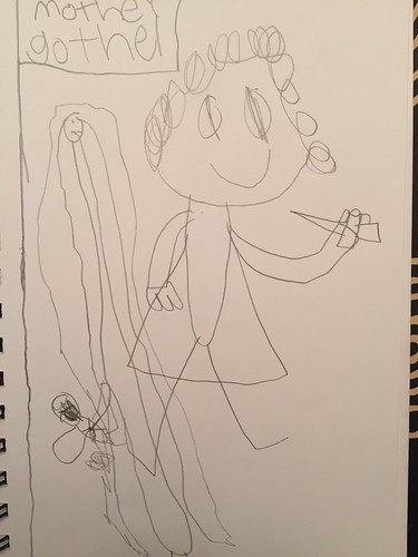
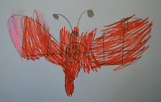
My 7 year old drew several villains but the ones he is willing to share are of Mother Gothel (with Rapunzel in the background) and Ursula.  I love that his version of the sea witch is inspired by a crustacean, all powerful claws and red rage.  Plus breasts.

Disney Villain - Gothel - AR

Disney Villain - Ursula - AR

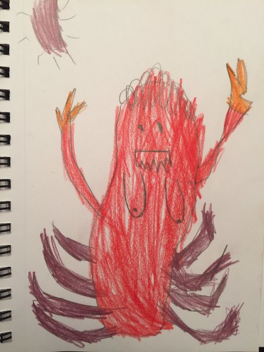
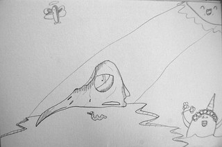
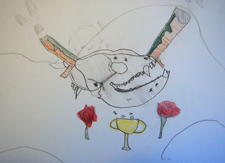
My 9 year old also drew Ursula.  He loves the octopus tentacles of the original so he kept those in his drawing but he gave her the jaws and teeth of a shark, turtle flippers for arms, and the dangling lure of an angler fish which I think is a pretty cool concept given that Ursula is all about temptation.

Disney Villain - Ursula - ET

My 13 year old opted to depict the Queen of Hearts and came up with a delightfully creepy illustration where she is wearing a sort of “Death Eater” type mask and has horribly sharp long fingers on one hand, ready to chop off heads.

Disney Villain - Queen of Hearts - AB


Sun Printing

You may have noted that when it comes to thinking up activities for my kids to do I definitely lean towards the Arts and Humanities.  My brain is not much capable of STEM learning and, as such, I think it best that I leave much of that to their formal education providers.  Sun printing, therefore, illustrates the proximity to which my activities with the kids broach science learning.  It definitely was an experiment, however, as I have never done sun printing myself.  We were all learning together.

I talked to my kids a bit about cyanotypes, an early form of photography and the process that creates what we think of as blueprints.  I explained that the paper we were using was coated with a photosensitive chemical and that exposure to the sun would cause a reaction.  We would then be developing the resulting print by rinsing it in a solution of water and a little lemon juice.  I told the boys that it reminded me of developing photographs in the dark room back in my High School days to which the oldest remarked, “You are that old?”  I let that one slide.  Science bit over, it was time to get creative and experiment.

First up was my 9 year old who wanted to use a water pistol because it had such a strong, recognisable shape.  We let the water pistol sit between the perspex and the paper for five minutes and then quickly moved it to the solution, which I had set up in the shade of the porch.  It was interesting seeing the colours switch from positive to negative (or vice versa as I am not sure which way they would be categorised).  Not overly happy with his first print, he then did a second using a dollar symbol that was much more flat to the paper.

Sun Print ET 1

Sun Print ET 2

Sun Print ET 3

Sun Print ET 4

Next up, my 13 year old decided to experiment with an Ugly Doll because it had a strong outline but was squishily dimensional.  The result showed the gradiation in colours that occurs when the sun is blocked to varying degrees.

Sun Print AB 1

Sun Print AB 2

Sun Print AB 3

My ten year old tried out a selection of toys from his room.  We assumed that the lizard, being flattest, would create the strongest silhoutte and that Batman would be the blurriest but our thesis turned out to be incorrect.  The Lego man was surprisingly effective as a mask.

Sun Print OA 1

Sun Print OA 2

My 7 year old decided to use items from nature and went hunting and gathering in the garden.  His turned out to be the best idea as his chosen foliage pressed completely flat beneath the perspex and resulted in the most clearly defined shapes.

Sun Print AR 1

Sun Print AR 2

Sun Print AR 3

I took a print from my house and car keys to see how the paper handled the mixture of flat items with slightly more dimensional items, such as the keyrings and car fob.  The photos show the change that occurs before and after the prints are washed in the developing solution.

Sun Print Laura 1

Sun Print Laura 2

Sun printing was a fun activity.  It was refreshing to be doing something together that none of us had any experience with so that we were all experimenting and learning together.  I have a few sheets of photosensitive paper left so we might return to this activity again before the summer is out.


Ink Blot Art

First of all let me state that this idea is not original to me.  I picked it up from somewhere but never made a note of where or from whom.  Therefore, if you recognise this activity and know where it originated then let me know so that I can add a credit here.

The idea behind this creative activity is a bit like a Rorschach Test whereby identifiable forms are glimpsed in ink blots.  A brush is liberally drenched in juicy India ink and then used to make marks on the paper in a completely instinctive way with no preconceived ideas as to placement, width, shape.  The resulting shapes are then considered and added to using ink pen to transform the random inky blots into recognisable images.

My 13 year old made marks that I thought suggested numbers.  He then turned these into funny little people – one of whom is being a bit rude and mooning.  Because my kid is a 13 year old boy.

Ink Blot Art AB2

Ink Blot Art AB1

My 9 year old thought his haphazard zigzagging looked like a tornado so he developed that idea into a twisting storm.

Ink Blot Art ET

The frenetic mark making of my ten year old, who is a comic book nut, suggested to him the symbiote from Spiderman, all lashing black shapeshifting and gnashing sharp teeth.

Ink Blot Art OA

My 7 year old got very excited about getting to use Mummy’s ink so he absolutely saturated his art journal pages in the jet black liquid and then got impatient about waiting for it to dry.  He turned the huge black blobs into faces.

Ink Blot Art AR1

Ink Blot Art AR2

I came up with three weirdly proportioned people and an alien.

Ink Blot Art Laura


Colour Block Silhouettes

Another of our summer “pot luck” activities was a study of shape and colour.  The idea was to create a silhouette, divide it up into sections, and then fill it with different shades of the same colour.

My ten year old, a comic book fanatic, decided to draw the recognisable silhouette of Batman.  Green is his favourite colour so he filled Batman with shades of green and that made us think how cool it would be if farmers could make their fields into silhouettes so we could all enjoy the fun shapes when flying overhead.

Colour Block Silhouette OA

My nine year old kept things simple and symmetrical with the clean shape of a butterfly.  He used gold and silver gel pen to colour it in which gave it a very pleasing shimmer in the sunlight.

Colour Block Silhouette ET

My thirteen year old chose a love heart and filled it with mostly metallic blue gel pen ink.  The glossiness of it made me think of a faceted gem stone.

Colour Block Silhouette AB

My seven year old went off piste a bit.  That is OK.  It is all about being creative after all.  He drew funny little monster characters and divided them up using lines and then coloured them.  One is a wee weirdo guy he called an “Igor beetle” and one is – as he explained – a “vampire butterfly”.

Colour Block Silhouette AR1

Colour Block Silhouette AR2

I drew the silhouette of a pig and coloured it using watercolour pencils in neutral, stone shades.  It kind of looks like a patio shaped like a pig.

Colour Block Silhouette LR

Paint Chip Doodles

Every Summer I undertake a project with my four sons.  The idea is that it keeps them busy and stimulated for a period each day, it might involve trying something new or learning something, it provides some structure and routine to each day of the (exceedingly long) summer break, and it gives us a focused activity to do together each day.

In previous years, the projects have very much had an educational focus.  For example, we did ancient civilizations a few years ago; the 50 states of America; Knights, Kings and Castles; and last year we studied History of Art.  This year, however, I am trying a slightly different approach.  This year, the spread of ages of the kids – the youngest being 7 and the oldest 13 – made it a challenge to settle on a subject that would be accessible to everyone.  So for this year I am experimenting with a less educational approach and making it more about sampling fun activities.  As such, I created a whole list of possibilities and printed them out on paper, folded, and popped them in a box so that we can do a “pot luck” each day.

First up then was an activity inspired by the wonderful Claudia McGill.  On one of her blogs, Claudia had shared some illustrations she had done using paint chips cards as her creative scaffolding.  I squirreled that idea away for future use and decided it was perfect for the pot luck.

I had collected up an assortment of paint chip cards last time I was in a DIY store so the boys were able to select colours that caught their eye or else look at the names of the paint shades and make a selection that way.  We drew on them with black biro for ease of use.  The only “rule” was that the name of the paint had to inspire the doodle.

Here is what my 13 year old came up with.  The pink strip is dishy coral, sweety pink, and prettiest pink; the red strip is magnificent red, show stopper, candy heart, and robust red; the pale green strip is heather green, pottery glaze, and misted mint; and the yellow strip is lime blast, alchemist, game changer, and ginger wasabi.

Paint Chip Doodles AB

My 7 year old wanted to work with all natural, neutral colours.  The dark brown strip is back in the saddle, brevity brown, woodsy hollow, and relaxed vibe (so relaxed that the wee figure is in fact deceased); the beige strip is tawny owl, linwood sands, and paper kraft; the red-brown strip is fireweed, burnt scarlet, farm stand apple, and coralbelle; and the grey strip is saxon grey, stone eagle, and icicle.

Paint Chip Doodles AR

My 9 year old doodled on these three paint chip cards: the green one is admiral bronze, pampas grass, rainforest floor, and olivine crystal; the peach hued one is coral odyssey (that’s Odysseus between his foes), indulgent peach, and coral perfection; the purple one is impulsive purple, opulent purple, allium blooms, and elusive violet.

Paint Chip Doodles ET

My 10 year old’s selection was a blue strip containing sweet lavender, celestial skies, and melodious; the brown strip containing fireweed, burnt scarlet, farm stand apple, and coralbelle; the yellow strip featuring lime blast, alchemist, game changer, and ginger wasabi; and the red strip of magnificent red, show stopper, candy heart, and robust red.

Paint Chip Doodles OA

Here are the doodles I produced:the blue strip containing sweet lavender, celestial skies, and melodious; the pink strip is dishy coral, sweety pink, and prettiest pink; the lilac strip is thistle, furtive mauve, and plumsicle; and the yellow strip features yellow & mellow, morning mimosa, and vanilla chai.

Paint Chip Doodles LR

It was a super quick, super thrifty, and super fun activity.  The kids all really enjoyed it so I can add this to my “rainy day” list of activities.  They plan to use their paint chip strips as bookmarks which I think is a great idea.

History of Art #32 – Haring

And so we come to our final lesson in our History of Art project.  It’s November and this project was supposed to only last for the summer break so, while in many ways it is a shame to bring it to an end, end it must.

I chose Keith Haring for our final lesson.  It seemed appropriate to end with a Pennsylvania born artist and I also had a feeling that the kids would really love his artwork, allowing us to end on a high note.  We looked at lots of examples of Haring’s artwork and discussed why he might have felt inspired to use blobby stick men lacking facial features.  We talked about the design of the figures being levelling, equalising across gender, race, age and other categories, resistant to labels, and how in many ways they were reminiscent of the stick figures our primitive ancestors were daubing on cave walls.  We also talked about Haring’s use of bold, vivid, neon colours contrasted with thick, black outlines, the graphic quality of his work, and the way he meshed “high” and “low” art forms.  We also got into a discussion about the use of art for political provocation and protest, specifically the way in which Haring used his “fun” art work to highlight subjects such as gay rights and HIV and AIDS.  We also looked for recurring motifs and symbols across dozens of works.

The boys were then set free to create whatever they wanted inspired by Haring’s works.  My oldest and youngest were the only two who opted to paint.  The 6 year old painted a figure whose arms end in wings, inspired by one of Haring’s paintings, but he could not resist the impulse to add facial features.  My 12 year old adopted some of Haring’s symbols – the pyramid, the pink triangles, the figures – to create his painting and discovered that drawing blobby stick figures is harder than it looks.

32 - Haring - AR1

32 - Haring - AB

My middle two sons were keen to work with polymer clay again and saw the blobby figures of Haring’s artwork as a jumping off point for sculpting little figures.  My 8 year old kept his small sculpture featureless but my 10 year old could not resist the temptation to add features to the figure.  Specifically, he turned the figure into an alien.  Since he used glow in the dark clay, the result was quite fun.

32 - Haring - E

32 - Haring - O

My youngest, seeing his big brothers messing around with the clay, decided to sculpt too.  Thinking of bright colours and black lines, he decided to make a bumble bee.  I think it turned out super cute.

32 - Haring - AR2

I worked in my art journal to create my Haring inspired painting.  I have not worked with neon paint since my chameleon over a year ago.  I didn’t find it any easier to work with this time around.  It goes on really thinly and the brush marks are always visible so that my scrappy, messy painting style is terribly evident.  The subject is probably obvious: my love for my four little Pictlings.

32 - Haring - Laura

We have had a lot of creative fun and interesting discussions and a whole lot of learning while undertaking this History of Art project.  Our recent trip to the Philadelphia Museum of Art proved that the learning was sticking.  My 8 year old also recently impressed his art teacher by knowing a whole lot about Chagall.  I also like to think that my boys have been inspired to just keep creating and to find inspiration all over the place, to try different media and try on different styles to see what fits.  I hope you have enjoyed reading about our project these past few months.  Now I need to have a think about what our next project will be.  Suggestions are always welcome!


History of Art #31 – Warhol

We have arrived at the penultimate lesson in our History of Art project.  The artist being covered was Andy Warhol and I knew his graphic style, his bold use of colour and his allusions to pop culture would appeal to the kids.  They were able to see the genre connections to Roy Lichtenstein’s art work right away which was pleasing.  We spent a lot of time looking at and discussing various Warhol paintings and prints.  It was interesting how much the art appealed to the boys’ sense of fun but there was not the same depth of discussion as there has been about many of the other artists we have studied.  We covered Warhol’s commentary on mass consumption, commercialism and celebrity but otherwise the discussion was pretty superficial.  Interesting.

I thought for sure that my 8 year old, as a massive fan of the king, would choose to work on his own version of an Elvis print.  He surprised me, however, and instead took his inspiration from the banana on the Velvet Underground’s album cover.

31 - Warhol - E

My 10 year old liked the idea of playing with iconic brand logos and so drew a can of coke from memory.

31 - Warhol - O

My 12 year old continued on his mission to make every drawing about either Minecraft or penguins and created a series of four Creeper portraits instead of Marilyns.

31 - Warhol - AB

My 6 year old went completely off piste and churned out several drawings.  I never ask my kids, “What is this?” so I cannot relay to you what his drawings depict.  He was inspired and he loved drawing.  That’s all that really matters.

31 - Warhol - AR3

31 - Warhol - AR2

31 - Warhol - AR1

Like my 10 year old, I went with Warhol’s use of brands and logos as my inspiration.  The Campbell’s soup can series was my jumping off point but I put a Halloween twist on things by combining my favourite fruit with my favourite vegetable to make a disgusting concoction, adding a zombie bunny to the logo and using unappetising colours.

31 - Warhol - Laura

History of Art #30 – Lichtenstein

My kids were over the moon when I announced that Roy Lichtenstein was the next artist we were studying in our History of Art project.  My oldest reads a lot of graphic novels and my younger three are comic book aficionados so the aesthetic of Lichtenstein’s art really appeals to them.  I introduced them to the concept of Pop Art and its use of popular mass culture and everyday objects as inspiration for art work.  Their familiarity with comic books meant that the boys found it easy to identify the elements that Lichtenstein used in his art work: strong black lines, primary colours, Ben Day dots, speech bubbles and onomatopoeia.

The boys all unanimously decided to use sharpies as their medium for their Lichtenstein inspired drawings.  My oldest continued with his penguin theme and drew a ninja penguin and his narwhal sidekick.  I think he did a great job with the composition.

30 - Lichtenstein - AB

My youngest drew a whole comic strip.  He can be a wee perfectionist and gets frustrated if a line or shape is not exactly as he intended.  He uses the eraser a great deal.  I was curious, therefore, about how he would handle drawing directly onto the paper with sharpie.  I was predicting some sort of flap and maybe a few scrumpled first drafts.  However, he worked diligently and precisely and with no eruptions.  I have no idea what the story is about.

30 - Lichtenstein - AR

My middle two sons are obsessed with Marvel and DC comics and characters so I knew that was what they would opt for in terms of subject matter.  My 8 year old loves Robin so that was what he plumped for.  He is also obsessed with pugs so his Robin has a super-pug sidekick.  I think his drawing has a lot of personality.

30 - Lichtenstein - E

My 10 year old opted for Batman and a showdown between him and Penguin.  I like his sparing use of colour and I think he has a strong sense of composition.

30 - Lichtenstein - O

I drew a face in my art journal and used the black lines and bold colours in order to emulate Lichtenstein.  I didn’t want to go dot crazy so I just used a few in certain places and I then added the “Kapow” in one corner even though in the context of the drawing it makes absolutely no sense.

30 - Lichtenstein - Laura

You can see my Lichtenstein Dotty Bunny over on my art blog.

History of Art #29 – Jackson Pollock

The next artist in our History of Art project was Jackson Pollock.  I must admit that I found teaching the boys about Pollock to be quite challenging because I don’t really “get” Pollock myself.  I appreciate that what he did to the art world was shake it up by being innovative, by placing the emphasis on the act of applying medium to substrate rather than on creating any preconceived image.  I, therefore, spoke to the boys about the dynamism of Pollock’s art work, the transference of his physical energy and the motion of the liquid media into the energy of his “action paintings”.  We also spoke about how Pollock moved away from traditional modes of painting by placing his canvases on the floor so that gravity assisted him rather than using an easel and working upright.

My original plan for getting the kids to have a go at “action painting” had been to place a large piece of paper outdoors and get them to splatter and throw and drip paint all over it.  However, we had two days of sub-zero weather this week so our arting had to be done indoors and I wasn’t about to let four boys throw paint around inside the house.  We, therefore, used the back up plan which was to use marbles and blobs of paint to move the paint around.  It still gave them the idea of using kinetic energy in a less controlled way to construct a painting.  They had an absolute blast dripping paint onto the paper and then rolling the marbles around.  It was good messy fun.

29 - Pollock - AB1

29 - Pollock - E1

29 - Pollock - Trio

My oldest cut up his Pollocked paper in order to continue with his Minecraft theme.  He turned it into a Creeper.

29 - Pollock - AB2

I decided to follow his lead and so I cut up the papers I made as demonstration pieces with the kids and turned them into a simple collage of a female head in my art journal.  Unlike Jackson Pollock, it seems I have to impose some sort of order on my art work.

29 - Pollock - Laura


History of Art #28 – O’Keeffe

This weekend we found some time to continue with our History of Art project which is finally nearing its conclusion – thankfully, given I had only intended for it to be a summer project.  Next up was Georgia O’Keeffe – a female artist at last!

We looked at her flower paintings and discussed their focus on colour and shape, the fluid lines, the idea of focusing on tiny details and transforming them into huge images.  The boys are not ready for Freudian interpretations so we didn’t touch that topic.  We also looked at her desert landscapes, her recreation of the colours of the geology of the region, the quality of light, the desert plants and the bleached skulls of animals.  That led to a brief conversation about painting both life and death.

It was inevitable that the boys would all plump for drawing skulls as soon as they saw O’Keeffe’s paintings of animal skulls in the desert.  There I was talking to them about using large brushes for painting flowers and mixing the sort of colours O’Keeffe used for her flower paintings and all the while I probably knew the boys were just thinking, “Bring on the skulls, mother!”  If we ever stumbled across a skeleton when out on a woodland walk we would react as if we had just found treasure.  Impromptu lessons on animal biology and adaptations would take place but so would a lot of poking with sticks.  Confession: we have a roe deer and a badger skull on a shelf in our basement.  So, yes, the drawing of skulls was inevitable.

My 6 year old immediately scurried off to the basement to grab the deer skull.  It was a great opportunity for me to teach him about observational skills and drawing while looking and the use of contour lines to build up a drawing.  I think he did a wonderful job.

28 - O'Keeffe - AR1

28 - O'Keeffe - AR2

My 10 year old drew a skull, part of a spine and arm bones forming part of a desert landscape.  He had intended to colour it in but then decided to go and play on the PS3 instead.  There is something about his drawing that makes me think of the skeletised dragon in the desert of Tatooine in ‘Star Wars’.

28 - O'Keeffe - O

My 12 year old, in keeping with his determination that every drawing has to be either Minecraft or penguin inspired, decided to draw a penguin skull.  He googled to find a photo of a penguin skull and drew from that.  He then added a little penguin angel floating in the sky, a happy sun, and a smiling narwhal.  A pretty peculiar wake.

28 - O'Keeffe - AB

My 8 year old has a minor obsession with raccoons so he decided that the subject of his drawing would be a raccoon skull.  We don’t own one of those so he pulled a photo of one up on my phone and then set about drawing.  I think his drawing of the skull has incredible detail in it and I am very impressed with it.  He plays electric guitar and had been listening to Guns ‘n’ Roses for inspiration so the motif from that band also found its way into his drawing.

28 - O'Keeffe - E1

28 - O'Keeffe - E2

I too succumbed to the lure of the skull.  When I was in High School, my art teacher had shelves filled with interesting objects we could draw or take inspiration from and among the items were several skulls.  I used to draw them quite often – but not as often as I drew his collection of battered old leather footwear.  My skull drawing skills are pretty rusty.  I started, however, with a floral doodle in watercolour.  It is the same flower doodle I have been drawing for almost my entire life.  I then did the same as my 8 year old and brought up a photo of a skull on my phone but I challenged myself to draw in India ink, with no pencil under drawing, so that I had to work with any errors or flaws, no erasing possible.  That explains the lack of symmetry.  The horns are ridiculously imbalanced.  I am quite happy with the quality of the drawing, however.

28 - O'Keeffe - Laura