This is one of those art journal pages that ultimately just defeated me. I painted so many layers on this sucker trying to get everything to balance out in an aesthetically pleasing way, including changing the colours several times, but ultimately I just threw my hands up and surrendered because I got sick of the sight of the same page in my art journal and wanted to move on. The one positive thing I can say about this illustration is that all of that layering led to some decent painty texture.
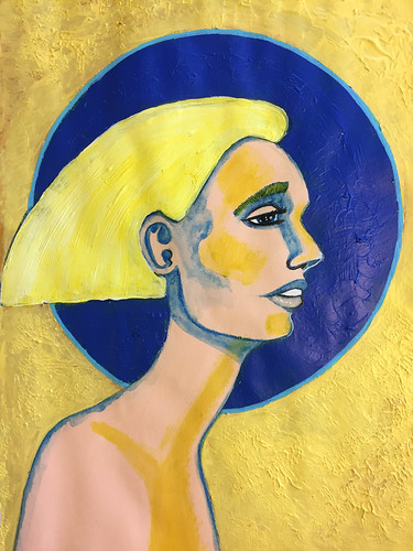

Yellow and blue have always been pretty together to me.
I agree. It’s a very fresh and uplifting combination. I just didn’t do the best job of it with this piece.
The yellow tint throughout is striking.
Thank you. I went a bit “dramatic” with the yellow on the figure. It ended up with a bit of an 80s vibe.
mystic face
Thanks!
I do like her swanlike neck.
Thank you. The underlying sketch was pretty good, if I do say so myself. It was the painting that was wholly inadequate and ultimately grotesque.
Instant Tilda Swinton vibe for me.
Maybe a dollar store knock off Tilda. 😆
Ha!
I think it still works well as a drawing/painting. I’d bet that some time from now you’ll be able to enjoy this page more. But moving on is sometimes the best way to deal. I do that. Have some issue with a project, move on and then some time later see it in a new and better light.
Definitely some pieces just have to be abandoned. I learned something from the experience of creating it so it wasn’t a complete waste of time or resources but it definitely wasn’t worth further investment. Not every art experiment is going to be a success.
Indeed! Anything worth doing is worth doing poorly at first. Funny thing tho with artwork there’s seldom anything wasted because your experiences compound and “amount to something” even when an individual art experiment is a dud.